
Identifying Issues in Usability and Accessibility and Reworking the Product Page

The Problem
Cholé, a high-end fashion brand, faces a critical challenge in providing an inclusive and user-friendly online shopping experience for all its customers. The current website exhibits usability and accessibility issues that hinder the seamless exploration and purchase of their products, leaving potential customers frustrated and excluded. Addressing these issues is imperative to enhance the brand's reputation, cater to a broader audience, and maximize online sales.
Role & Responsibility
UX designer: Heuristic Evaluation, Qualitative evaluation, Accessibility, Redesign
Methods
Assessment, Evaluation, Design, Compliance
Usability and Accessibility
Inclusivity
Approaches
Heuristic, Quantitative, Qualitative, WCAG A11y
Timeline
3 weeks
Heuristic Evaluation
As part of a collaborative team effort, we conducted a comprehensive heuristic evaluation of the website, identifying and meticulously categorising usability issues according to their respective levels of severity.
Consistency and Standards
Heuristic
Severity 3
Inconsistencies in size labels and the absence of size guides for certain items pose challenges in maintaining heuristic consistency and adherence to industry standards.


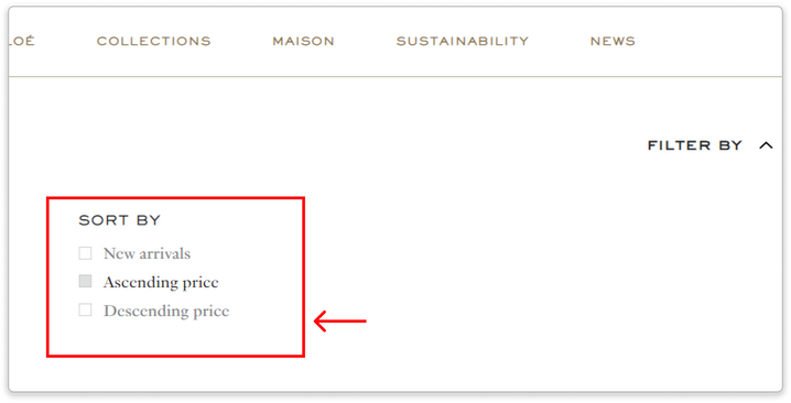
Mental Model | Consistency & Standards
Heuristic
Severity 3
The site employed terminologies like 'Ascending order' and 'descending order' for sorting, which presented a potential cognitive disconnect for users. Research and user feedback have consistently shown that customers tend to prefer and are more accustomed to terms such as 'low to high price', 'Recommended', 'high to low price' or similar conventions used extensively across the web.
Severity 2

Severity 3

Severity 4

The initial heuristic evaluation, while valuable, did not provide direct user insights and raised concerns about potential designer bias. As a result, we decided to complement our assessment by conducting a quantitative evaluation to gather data-driven insights and ensure a more objective analysis of the user experience.
Quantitative Evaluation

The above tasked was assigned to a group of five male participants, and we assessed the following metrics:
-
Task Completion,
-
Task Time,
-
Errors Made,
-
Lostness Metric, and
-
System Usability Score (SUS).
Task time

Issue 1
-
The majority of participants spent a considerable amount of time selecting the correct size.
Errors made

Issue 2
-
The common mistakes observed were related to the selection of the appropriate filter.
Task completion

Issue 3
-
The participants spent a significant amount of time adding the product to their wishlist.
The lostness metric


SUS Score

To gain a deeper understanding of the issues, we sought to conduct qualitative interviews, engaging participants in think-aloud sessions to comprehend their thoughts and pose follow-up questions.
Quantitative Evaluation
Each participant was assigned specific tasks, and we observed their behaviors, emotions, and documented their thoughts throughout the task execution.
01.

2/3 users attention was first drawn toward the pants category and missed out on the denim category


-
The filter did not provide a wide range of options for filtering and finding products, causing users to revisit each page twice before finding the right product, which confused them further.
02.

2/3 of users didn’t notice the size guide button

-
Not being able to find the right size can frustrate the users. They might abandon their cart because they don't have to worry about returning the item in case they choose the wrong size.
A demonstration of our qualitative evaluation conducted over Zoom. We revisited the recordings to take note of participants' emotions as they went through the executed tasks.
The participant conveyed the entire experience, expressing the following emotions.


03.

In all 3 users' opinions, it was unexpected that the remove button deleted only one quantity of a product from the checkout page, not the entire product.
Missed the modify button to increase the quantity of a product


-
Unexpected functionalities of the buttons led the participants to complete the given tasks with additional clicks, which led them to being confused.
Key takeaways
-
A user's cultural background affects how they pursue images, words, and the user flow.
Two users of the same ethnicity made the same mistakes and interpreted the data the same way. It includes how they view the website and how they interact with it. -
In spite of our belief that this would not be an issue, the users made mistakes that showed us otherwise
-
Not being able to understand or complete the task can create self-doubt in the user’s mind.
-
A user who is presented with a lot of information is likely to adopt an anchoring bias, where they rely most on the first piece of information available
Accessibility
After conducting a usability test on the website, I actively sought out accessibility issues. Following the WCAG guidelines, I systematically ran through a checklist against the website and identified numerous issues.
01. No Alt text for images effecting those who rely on screen readers

02. 400+ Contrast issues found that would pose difficulty in reading

03. Users who depend on keyboard functionality to navigate the website experience frustration cased by keyboard trap as they have to pasrse through everything to get to a particular section.

04. No visual indication when navigating through the website using the keyboard

More issues were recorded and put together in an excel sheet and rated against severity


The Redesign
Why the product page
A product details page serves as a crucial source of information, encompassing shipping details, size, color, availability, quality, wish list functionality, and more. Ensuring transparency in providing this information is paramount for customer satisfaction.
-
During initial website testing, it was observed that users overlooked the product description and shipping information. Those who attempted to find shipping details faced confusion, leading to clicking through every dropdown.
-
Size selection posed challenges, with several clothing products lacking a size guide. Participants struggled to locate the style guide within the size selection, and the existing size guide proved difficult to comprehend. Unfortunately, time constraints prevented addressing these size guide issues during testing.
-
Users encountered difficulties when attempting to add the same item to their cart, resorting to repetitive clicks on the Pre-order or Buy button. Additionally, modifying the order quantity required several clicks.
The original design

The re-design

1. Lack of Clear Stock Status Indication:
Users had to go to the product details page and check the size guide to find out if a particular product was out of stock.
If Low stock/Unavailable stock is displayed at the top of the product detail page, the user will be aware of its current availability before proceeding to the next information.
2. No Upfront cost indication for additional charges
One of the participants in the qualitative interview inquired as to whether there were any other fees in addition to those that had been specified.
Provides assurance to the user if any additional charges will be charged or if tax is included in the price.
3. Easy access to available size and the size guide.
Accessing the available sizes and reviewing the size guide necessitated an extra click. Initially, the size guide was only provided for select products, leading to ambiguity and inconsistency across items.
To enhance user experience, relocating the size guide to the end of the product details allows users to effortlessly spot it while scanning from left to right. Additionally, displaying the available quantity minimises the need for extra clicks, streamlining the user's interaction with the item.
4. Adding multiple quantity of the product
Previously, when users intended to purchase the same product multiple times, they were required to initiate a new BUY/PRE-ORDER transaction for each instance or make separate modifications in the shopping bag.
By introducing a quantity button, users can effortlessly adjust the quantity without hassle or the need for additional clicks. Streamlining the process minimises clicks and enhances the overall user experience when placing orders, promoting efficiency and user satisfaction.
5. Shipping Information
Since the shipping information was not prominently displayed on the product page but rather tucked away in the service section, users were compelled to verify the delivery date and associated charges directly on the checkout page.
Enhancing transparency by showcasing shipping details on the product page prevents users from being surprised during checkout, reducing the likelihood of cart abandonment.
6. Being Inclusive
Users faced difficulty using the model in the picture as a size reference for selecting clothing for their girlfriend due to the lack of proper indications of the model's size.
By dynamically selecting model images based on the chosen size, users can obtain a closer approximation of the right size for the clothing they wish to purchase, enhancing the decision-making process.

7. Making it easier for the users to check the reference image
Users found it cumbersome to scroll through the entire reference image set, leading to a loss of focus when using two images.
Users generally prefer focusing on one task at a time, allowing them to concentrate on the content in front of them. Viewing a single image at a time eliminates distraction and enhances user comfort. Additionally, rather than scrolling through an entire image gallery, users can conveniently select the specific image they wish to view.
8. Breadcrumbs
The user's journey to the specific page was not indicated.
Incorporating breadcrumbs provides users with a navigational aid, allowing them to understand their position within the website and facilitating seamless navigation back and forth.
Conflict
Customer reviews are now a crucial component of every website since they help users feel safe and trusted when making a purchase. However, high-end brands like Chloe, YSL, Michael Kors, and others choose not to use consumer feedback to preserve their brand image, and all high-end apparel brands adhere to this practice.
Accessible
highlighting all of the buttons and links that can be clicked not only with colour, but also with additional components like an underlining, checkmark, and others. This helps those who are colourblind to differentiate the selected or clickable components.
Limitations
-
The methods we adopt next can be affected by those we have already implemented.
-
The researchers are left with new questions after testing the application with users
-
It can be a time-consuming process. It can be difficult if their schedules are unpredictable or they keep postponing it.
-
A language barrier can lead to a great deal of confusion when communicating with users. As a result, we may not ask the right question.
-
Designers' experiences can impact the way evaluations are conducted.
-
Our assumptions at the beginning of our evaluation can be affected by testing with users from different cultural backgrounds.
-
The participant's actions and words do not match.
Learnings
-
Attention to Detail: During the evaluation process, I recognised the critical importance of scrutinising every aspect meticulously. This approach proved essential in identifying and addressing potential issues comprehensively.
-
Empathy with Users: Cultivating empathy for users emerged as a valuable skill during the evaluation. By understanding and sharing in the users' experiences, it became more evident how certain aspects of the website could lead to frustration. This insight contributed significantly to improving the overall user experience.
-
Understanding the Importance of Identified Issues: Realising the impact of identified issues on the user experience was a pivotal learning. Recognising how even subtle details could significantly influence user satisfaction underscored the importance of addressing these issues proactively. This awareness fueled a more dedicated approach to creating designs that prioritise user needs and preferences.
